Custom Fields for Payment Pages
Payment Pages support up to ten custom fields that collect additional information from customers alongside their payment. Custom fields appear on the payment form between the standard customer details and the Pay Now button. This page covers each field type and its configuration options.
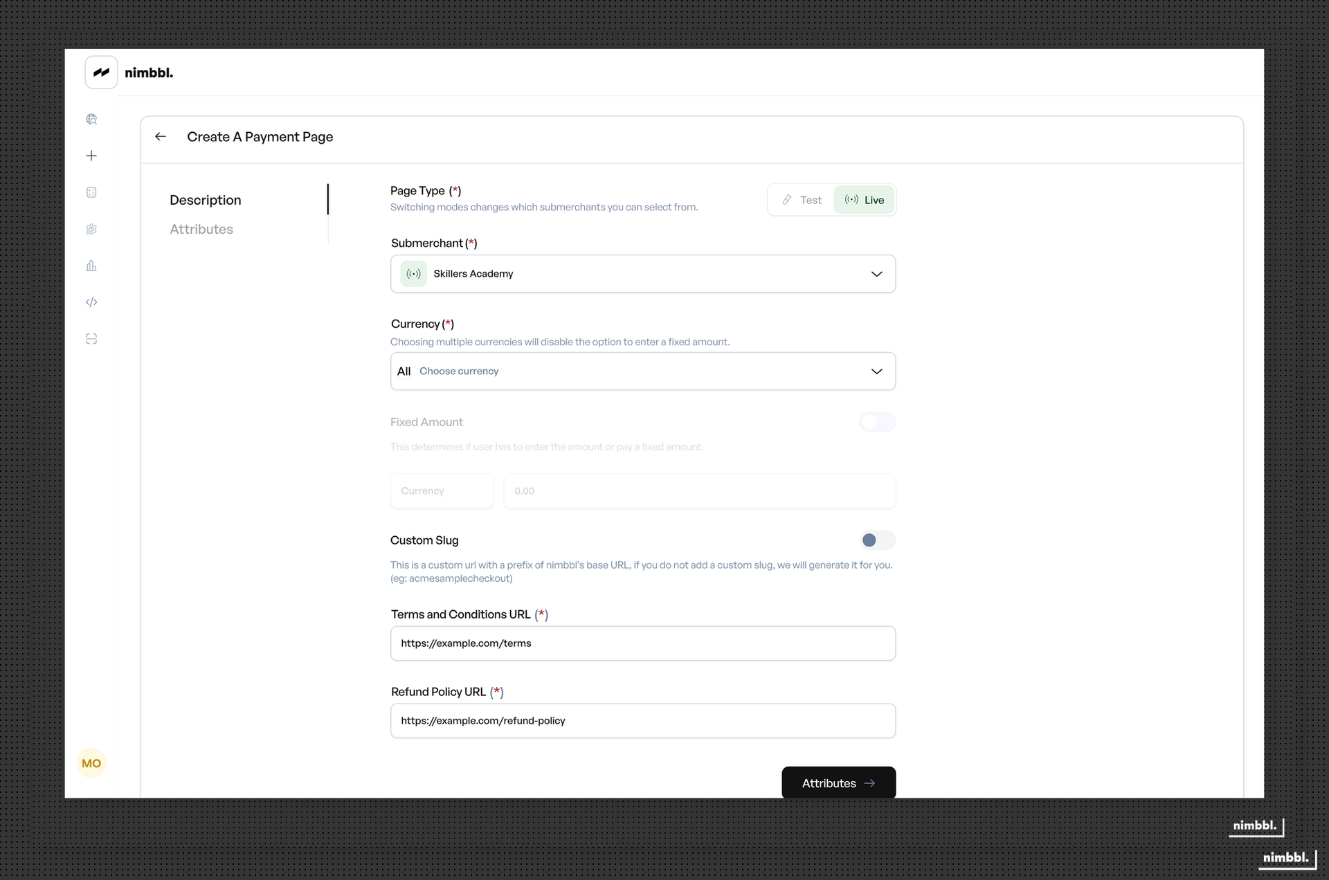
Custom Field Overview
Custom fields are added on the Attributes tab when creating a Payment Page. Each field requires a type, label, and sequence number. You can also configure help text, validation rules, and whether the field is mandatory.
Key rules for custom fields:
- Maximum 10 fields per payment page
- Sequence numbers must be greater than zero and unique within the page
- Each field can be mandatory (customer must fill it) or optional
- Fields appear on the customer form in sequence order
Text Field
Text fields accept free-form text input from customers. They are the most flexible field type.
Configuration options:
- Label -- the field name displayed to the customer
- Placeholder / Help text -- hint text shown inside the field before the customer types
- Mandatory -- whether the customer must fill this field
- Regex validation -- an optional regular expression pattern that the customer's input must match. The default pattern allows 1 to 256 characters.
Use cases: collecting names, addresses, order references, notes, or any free-text information.
Dropdown Field
Dropdown fields present a predefined list of options for the customer to select from.
Configuration options:
- Label -- the field name displayed to the customer
- Dropdown options -- a comma-separated list of values that appear in the dropdown menu
- Mandatory -- whether the customer must select an option
Use cases: selecting a product variant, choosing a department, picking a payment reason, or any scenario with a fixed set of choices.
Boolean Field
Boolean fields present a yes/no or true/false selection. They render as a toggle or checkbox on the customer form.
Configuration options:
- Label -- the field name or question displayed to the customer
- Mandatory -- whether the customer must make a selection
Use cases: consent checkboxes, opt-in/opt-out selections, yes/no questions, or any binary choice.
Date Field
Date fields present a date picker for the customer to select a date.
Configuration options:
- Label -- the field name displayed to the customer
- Mandatory -- whether the customer must select a date
Use cases: collecting event dates, delivery dates, birth dates, or any date-specific information.
Date and Time Field
Date and Time fields present a combined date and time picker.
Configuration options:
- Label -- the field name displayed to the customer
- Mandatory -- whether the customer must select a date and time
Use cases: scheduling appointments, specifying delivery windows, collecting precise timestamps, or any scenario requiring both date and time.
Field Configuration Rules
| Setting | Description |
|---|---|
| Sequence | Must be greater than 0 and unique within the page. Controls display order. |
| Mandatory | When enabled, the customer cannot submit the form without filling this field. |
| Help text | Placeholder text (for Text fields) or descriptive text (for other fields) shown to the customer. |
| Validation | Text fields support regex patterns. Dropdown fields validate against the defined options. Other field types use their respective picker validation. |
| Field Type | Configuration Options | Validation Rules | Common Use Cases |
|---|---|---|---|
| Text | Label, placeholder, regex, mandatory | Regex pattern (default: 1-256 characters) | Names, references, notes |
| Dropdown | Label, options list, mandatory | Must match a defined option | Product variants, categories |
| Boolean | Label, mandatory | True/False | Consent, opt-in |
| Date | Label, mandatory | Valid date from picker | Event dates, delivery dates |
| Date and Time | Label, mandatory | Valid date-time from picker | Appointments, schedules |